Your product pages are the core of your website. It’s where your customers will spend most of their time browsing, to see what you have to offer them. You also have full control over the look of your product pages separate from the Homepage and other areas.
Look And Feel:
1 The first step is to open the theme settings area of your Shopify theme config and go into the Product Page section.

2 You can change the Product Title Color here.

3 Next, click the dropdown and select font size for the Product title text.
You can change it's font style from "Product Title Font Style" settings.

4 Now, select a color for the product price text.
you can change it's font size and font style from "Product Price Font Size" and "Product Price Font Style" settings respectively.

5 Now, select color for the product compare at price text.
you can change it's font size and font style from "Product Compare At Price Font Size" and "Product Compare At Price Font Style" settings respectively.

6 Now, scroll down and go to the Look and Feel of Product Tabs section.
Here you can change the background colors for the product tabs.

7 Here you can change the Border Color for the product tabs.
You can also define the selected tab border color, this relates to the highlight at the top of an active tab.

8 Next, select color for tab title text.
select font size for tab title text from "Title Font font size" setting.

9 Next, select font style for tab title text.

10 Next, select font size for tab description text.

11 Product page tabs.

Here's an interactive tutorial for the visual learners
https://www.iorad.com/player/1601206/Demostore---Product-page-settings---Look-and-feel
Product Title Color – Changes the color of the product title.
Product Title Font Size – Changes the size of the product title.
Product Title Font Style – Changes the style of the product title. Lighter, Normal, Bold, and Bolder.
Product Price Color – Changes the color of the product price.
Product Compare At Price Color – Changes the color of the “compare at” price.
Product Price Font Size – Changes the font size of the product price.
Product Price Font Style – Changes the style of the product title. Lighter, Normal, Bold, and Bolder.
Scarcity Bar Settings:
Enable Product Scarcity Bar – Toggles the scarcity bar on or off.
Product Scarcity Bar Style – Changes the style of the product scarcity bar. Lighter, Normal, Bold, and Bolder.
Count Real Quantity – Tick this if you want to display the true quantity sold of an item.
Display Total Quantity – Toggles the display of total quantity of a given product.
Enable Scarcity Bar Text – Toggles the scarcity bar text on or off.
Scarcity Bar Text – Allows you to put a small CTA to encourage action. Ex: “Stock is running out:”
Show Scarcity Bar In Collection Page And Product Slider – Toggles the scarcity bar to display on collection pages, and product sliders, underneath the product.
Progress Bar Text Color – Changes the color of the progress bar.
Progress Bar Text Font Size – Changes the font size of the progress bar.
Progress Bar Text Font Style – Changes the text style of the progress bar. Lighter, Normal, Bold, and Bolder.
Scarcity Bar Background Color – Changes the background color of the scarcity bar.
Scarcity Bar Fill Background Color – Changes the fill color of the scarcity bar.
75 Percent Or More Fill Background Color – Changes the fill color of the scarcity bar.
Quantity Font Color – Changes the font color of the quantity counter.
Quantity Font Size – Changes the font size of the quantity counter.
Quantity Font Style – Changes the text style of the quantity counter. Lighter, Normal, Bold, and Bolder.
Price Text Settings:
Enable Your Price Text – Inserts “Your Price” above your product price. A personalization feature.
Zoom Settings:
Enable Inner Zoom – Enables the inner zoom mode for product photos.
Enable Lightbox Zoom – Enables lightbox zooming, which places a transparent background behind the product photo to focus.
Zoom Mode – Choose the zoom type you want. Inner, left, right, top, and bottom. Inner is recommended. The other settings will change how the zoom itself works.
Zoom Setting (Hover or On Click) – Choose how your product photo zoom will work. Hover or Click to Zoom. Hover is recommended, they can click to zoom regardless.
Display SKU
Enable SKU – Enables or disables display of your product’s SKU (Stock Keeping Unit). This is typically an internal need, however if you’re reselling a known product, enabling SKU can potentially help with SEO.
Back In Stock Request Form:
1 The first step is to open the theme settings area of your Shopify theme config and go into the Product Page section.

2 Now, scroll down and go to the "Back in stock request form" section.
Enable the feature to show the back in stock form when a product is not in stock.

3 Enter a label for the text that shows above the email input field.
Ex. 'Notify me when this product becomes available'

4 Enter placeholder text for the email input field.
Ex. 'Email Address'.

5 Enter form submit button text.
Ex. 'Alert Me'.

6 Your back in stock request form will show for and products with 0 quantity.

7 The Back in Stock Request Form allows your customers to sign up and receive a notification when an item is back in stock.

Here's an interactive tutorial for the visual learners
https://www.iorad.com/player/1601201/Demostore---Product-page-settings----Back-In-Stock-Request-Form
Back In Stock Request Form For Variants:
7 STEPS
1 The first step is to open the theme settings area of your Shopify theme config and go into the Product Page section.

2 Now, scroll down and go to the "Back in stock request form fpr variants" section.
Enable the feature to show the back in stock form when a product is not in stock.

3 Enter a label for the text that shows above the email input field.
Ex. 'Notify me when this product becomes available'

4 Enter placeholder text for the email input field.
Ex. 'Email Address'.

5 Enter form submit button text.
Ex. 'Alert Me'.

6 Your back in stock request form will show for any product variants with 0 quantity.

7 The Back in Stock Request Form for variants allows your customers to sign up and receive a notification when a particular variant is back in stock.

Here's an interactive tutorial for the visual learners
https://www.iorad.com/player/1603952/Demostore---Product-page-settings----Back-In-Stock-Request-Form----Copy
Enable – the Back in Stock Request Form allows your customers to sign up and receive an email when they product they want is back in stock. This is great to help build your email list and see what customers want the most.
Sticky ATC Bar:
15 STEPS
1 The first step is to open the theme settings area of your Shopify theme config and go into the Product Page section.

2 Now, scroll down and go to the "Sticky ATC Bar" section.
Click Enable Sticky ATC bar. The Sticky ATC bar will show at the bottom of the screen on desktop.

3 Now, select the Sticky ATC bar style that you would like to use on your store.

4 If you enable (ATC / BUY Button with option Slide) then the sticky ATC will show both buttons "Add to cart" and "Buy now" with the variant selection options slide.

5 If you enable (ATC / BUY Button without option Slide) then the sticky cart will show both buttons "Add to cart" and "Buy now" without the option slide showing on click.

6 If you enable (Primary Button only with option Slide) only the primary button will show with option slide on click.

7 If you enable(Primary Button only without option Slide) then only the primary button will show without the option slide on click.

8 We recommend you enable this option to hide the product page ATC on mobile when using the mobile sticky ATC bar.

9 Next, enter text for the sticky add to cart button text.
Ex. '+ Add To Cart'.

10 Select a background color for your ATC button.

11 Select a color for ATC button text.

12 Enter text for sticky buy now button.
Default text is "Buy Now".

13 Next, select a background color for sticky buy now button.
Change it's text color from "Text Color of Buy Now button" setting.

14 Enter text for the out of stock product tooltip.
It will show on mouse hover of the buttons on an out of stock item.
Ex. "Currently out of stock"

15 Sticky ATC bar on product page.

Here's an interactive tutorial for the visual learners
https://www.iorad.com/player/1601200/Demostore---Product-page-settings---Sticky-ATC-Bar
Enable Sticky ATC bar – Enables display of the sticky ATC bar.
Disable Sticky ATC bar in Mobile – Enable or disable the display of the ATC bar on mobile.
Size Chart:
10 STEPS
1 The first step is to open the theme settings area of your Shopify theme config and go into the Product Page section.

2 Now, scroll down and go to the Size Chart section.
Make sure that the size chart feature is enabled here.

3 Next, select size chart page by clicking on "select page".
(make sure you have created a page in the back end of your Shopify admin if you haven't already)

4 Now, go to admin all products section and open a product in which you would like to show the size chart.
Scroll down and go to tag section and add "view-size-chart" tag.

5 You can also show a specific size chart on a product.
First create a page named 't-shirt' for example. This will be a size chart for your t-shirts. To apply this size chart to any t-shirt, just apply the tag 'sizechart-t-shirt' to the product.

6 A typical size chart page is shown here.

7 Size Chart on Product Page.
You can change it's color from the "Size Chart Link Color" setting.

8 Select a font size for size chart text.
You can also change it's font style from the "Size Chart Link Font Style" setting.

9 Select font size for size chart text.
Also, you can change it's font style from "Size Chart Link Font Weight" setting.

10 Size chart popup in Product page. The size chart allows you to display sizing needs for your products.

Here's an interactive tutorial for the visual learners
https://www.iorad.com/player/1601203/Demostore---Product-page-settings--size-chart
The size chart allows you to display sizing needs for your products.
Our size chart feature works via tags applied on a product level.
For example, if you have the tag 'sizechart-t-shirt' applied to a product, be sure to create a page named 't-shirt' this will then act as the size chart for the t-shirt.
'sizechart-jeans' create a page called 'jeans' and so on.
Size Chart Link Color – Changes the link color of the size chart.
Size Chart Link Font Size – Changes the font size of the size chart link.
Size Chart Link Font Style – Changes the font style of the size chart link. Lighter, Normal, Bold, and Bolder.
Progress Bar Height – Unsure of this one’s function.
Add To Cart Button:
27 STEPS
1 The first step is to open the theme settings area of your Shopify theme config and go into the Product Page section.

2 The Cart style on ATC dropdown decides how the cart behaves when the customer adds an item to cart.

3 Select Pop-Up Modal – When an item is added a popup window is displayed revealing the contents of the cart.
I'll demonstrate with the Pop-Up Modal option.

4 The customer will see the following Pop-Up window when adding an item to cart.

5 Select Dropdown Confirmation –
This option will display a dropdown below the header which displays cart contents and costs.

6 Select Slide Out Cart – Slides out a vertical cart on the right side of the screen.

7 Select Skip Cart and Go Directly to Checkout – Skips the cart page entirely and sends the customer directly to the checkout page.

8 Select Redirect to Cart Page – Redirects customers to the cart page.

9 If enable Add to cart, then shows only add to cart (or primary button)

10 Customers can use the dynamic checkout button to quickly buy the product they're viewing. They skip the cart and complete their payment with the checkout method displayed on the button.

11 If you enable full width, the length of the add to cart button will expand to utilise more of the customers screen width.

12 Toggles ATC animation on or off. (this causes the ATC button to shake from side to side, drawing the customers attention)
13 Toggles display of your checkout icon, should you choose to upload one.

14 Use Custom checkout Icon- Upload a png image to show under the add to cart icon.

15 The image shows under the add to cart button as follows.

16 Add To Cart Icon – Allows you to change the icon on the ATC button. Stock is a “+”.

17 Select any Background Color – Changes the color of your ATC button.

18 Border Color – Changes the border color of your ATC button.

19 Select any Font Color – Changes the font color of your ATC button.

20 Hover Background Color – Changes the hover color for your ATC button.

21 Hover Font Color – Changes the font color of the hover gesture.

22 Select any Font Size – Changes the font size of the ATC icon.

23 Select Font Style – Changes the font style of the ATC button. Light, Normal, Bold, and Bolder.

24 Add To Cart Text – Allows you to change the ATC button text. Ex: “Buy Now.”

25 Free Shipping Add To Cart Text – Displays on any product with the ‘free-shipping’ tag.

26 Adding To Cart Text – Allows you to change the “adding to cart…” text.
This text will display briefly after a customer clicks on the ATC button.

27 Added To Cart Text – Allows you to change the “added to cart” text. Ex: “Your items have been added.”

Here's an interactive tutorial for the visual learners
https://www.iorad.com/player/1605771/DemoStore-Product--Add-to-cart-Button
Cart Style On ATC – Select how the cart will act when a customer hits the add to cart button.
Dropdown Confirmation – Displays a drop-down underneath the header cart icon when an item is added to cart.
Slide Out Cart – Slides out a vertical cart on the right side of the screen.
Skip Cart and Go Directly to Checkout – Skips the cart process and sends the customer to the checkout page.
Redirect to Cart Page – Redirects customers to the cart page.
Popup Modal – When an item is added a popup window is displayed.
Full Width – Expands the ATC button full width on a user’s device. (Stretches across the screen)
Enable Animated ATC Button – Toggles ATC animation on or off. (this causes the ATC button to shake from side to side, drawing the customers attention)
Enable Checkout Icon – Toggles display of your checkout icon, should you choose to upload one.
Add To Cart Icon – Allows you to change the icon on the ATC button. Stock is a “+”.
Background Color – Changes the color of your ATC button.
Font Color – Changes the font color of your ATC button.
Hover Background Color – Changes the hover color for your ATC button.
Hover Font Color – Changes the font color of the hover gesture.
Font Size – Changes the font size of the ATC icon.
Font Style – Changes the font style of the ATC button. Light, Normal, Bold, and Bolder.
Add To Cart Text – Allows you to change the ATC button text. Ex: “Buy Now.”
Free Shipping Add To Cart Text – Displays on any product with the ‘free-shipping’ tag.
Adding To Cart Text – Allows you to change the “adding to cart…” text.
Added To Cart Text – Allows you to change the “added to cart” text. Ex: “Your items have been added.”
Visitor Counter:
7 STEPS
1 The first step is to open the theme settings area of your Shopify theme config and go into the Product Page section.

2 Go into the Visitors counter section.
Enable – Toggles visitor counter on or off.

3 Visitor Counter text after – Change the visitor counter text.
Ex: “Visitors Right Now”

4 Minimum Visitors – Change the minimum amount of visitors that will display using demo data. Ex: 2

5 Maximum Visitors – Change the maximum amount of visitors that will display, using demo data. Ex: 11

6 Put Visitors text.
Ex. ''People are viewing this item

7 Display Visitor Counter bar.

Here's an interactive tutorial for the visual learners
https://www.iorad.com/player/1601198/Demostore---Product-page-settings----Visitor-Counter
Enable – Toggles visitor counter on or off.
Visitor Counter After text – Change the visitor counter text. Ex: “Browsing this product”, “Ready to purchase.”
Minimum Visitors – Change the minimum amount of visitors displayed. Ex: 10
Maximum Visitors – Change the maximum amount of visitors displayed. Ex: 47
Order Counter:
11 STEPS
1 The first step is to open the theme settings area of your Shopify theme config and go into the Product Page section.

2 Go into the Orders Counter section.
Enable the feature.

3 Customize the orders counters text here - Ex. "People have recently bought this"

4 Select static type.

5 Select time period.

6 You can also enable demo data for product orders information.

7 Minimum Orders – This is the low end number, the smallest value that will show when using the demo data feature.

8 Maximum Orders – This is the high end number, the largest number that will show when using the demo data feature.

9 Orders counter shown off here (demo mode).

10 You can also use the orders counter variable in the informations alert here. '[orders_counter]'.

11 Shows order counter price on informations alert.

Here's an interactive tutorial for the visual learners
https://www.iorad.com/player/1603849/Demostore---Product-page-settings----Order-counter
General Settings:
24 STEPS
1 Select Show quantity selector – Toggle order quantity selector on or off.

2 Show saved amount – Shows how much a customer has saved if using discount pricing methods. Ex: “Saved 35%”

3 Shows a compare price if a product has one.

4 Shows related products. (only visible within a collection)

5 Benefit Bullets – Replaces standard bullets with a checkmark.

6 Benefit bullets.

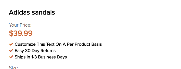
7 You can enable a checklist below the product price here.

8 Here is our example checklist, to display this on a product we applied the tag to a product.
'checklist-Ships in 1-3 Business Days'

9 You can enable variant swatches here, these are the little square color icons that can display on products, representing different variants.

10 Select your swatch style here.
You can pick either color swatches or variant images or simply a text label.

11 Enabling this option allows you to embed videos from YouTube, Vimeo, etc to your product page.

12 Use Option Selection Error Text – Enables the display of an error message if an option is incorrect.

13 Show Product Thumbnail Images Slider – Enables use of the thumbnail slider underneath (or to the side) of your main product image.

14 Enable Product Personalisation /Personalization – Enables product personalization for POD items and engraving needs.

15 A couple of product personalization examples are shown here.
Tags to achieve this -
personalisation-child's_name-25, personalisation-child's_age-2

16 Benefit Bullets Color – Set the color of the benefit bullets here.

17 Enable/Disable the image below the product description here.

18 Enable product sharing – Toggles social product sharing on or off. (This will basically enable the display of the social sharing icons on product pages)

19 Enable product sharing on mobile – Toggles social product sharing on or off in mobile.

20 Share on Facebook - Enables facebook sharing.

21 tweet on Twitter - Enables sharing to twitter.

22 pin on Pinterest - Enables Pinterest sharing

23 Allow adding to Fancy.

24 Social sharing options shown here.

Here's an interactive tutorial for the visual learners
https://www.iorad.com/player/1601199/Demostore---Product-page-settings----General-Settings
Enable image zoom – Toggles image zoom on or off. If this is unchecked, images will not zoom in.
Show quantity selector – Toggle order quantity selector on or off.
Show saved amount – Shows how much a customer has saved if using discount pricing methods. Ex: “Saved 35%”
Show compare at price – Shows the compared at price. This is typically higher than your selling price. Ex:
$97
Your Price:
$74.99
Show related products – Shows customers related products. Only visible within a collection.
Benefit Bullets – Replaces standard bullets with a checkmark. Recommended.
Enable Checklist – Enables the checklist feature (displays bullet points by the price of the product)
The benefit bullets work via tags assigned to each product, for example on our demo store we use the tags -
- checklist-Ships in 1-3 Business Days
- checklist-Easy 30 Day Returns
- checklist-Customize This Text On A Per Product Basis
This will achieve the following result -
Use Variant Swatches – Enables the use of variant color swatches. These are the colored squares you typically see for products like shirts, jewelry, and other custom items.
Use Video Embedding – Enabling this option allows you to embed videos from YouTube, Vimeo, etc to your product page.
Use Option Selection Error Text – Enables the display of an error message if an option is incorrect.
Show Product Thumbnail Images Slider – Enables use of the thumbnail slider underneath your main product image.
Enable Product Personalisation /Personalization – Enables product personalization for POD items and engraving needs.
Product Description
Benefit Bullets Color – If you decide to place your benefit bullets within your product description as opposed to the tag method, use this to pick the color of your bullets.
Social Media Sharing
Enable product sharing – Toggles social product sharing on or off. We recommend enabling.
Show shared count – Displays the number of times a product has been shared. Only available for Facebook, Twitter, and Pinterest.
Promotion Bar
Enable – Toggle the promotional bar on or off.
Promotion Text – Allows you to change the promotional text. (Use the code ‘$x’ to insert the dynamic free shipping threshold number) Ex: “Free Shipping For Over $49 to”
Show Free Shipping Achieved Text When Threshold Is Met – Informs a customer when they’ve met your free shipping threshold.
Display User Country – Displays the user’s country.
Total Sold Flash:
10 STEPS
1 The first step is to open the theme settings area of your Shopify theme config and go into the Product Page section.

2 Locate the total sold flash section and make sure to enable the feature.
You can also replace the flashing fire icon if you so wish to do so.

3 Change font size of text here.

4 Change the font style of the text here.

5 Enable demo data if you wish to show demo instead of real data.

6 Put Mininum Quantity for your demo data here.
This is the lowest value the low end will display.

7 Put Manimum Quantity for your demo data here.
This is the highest value the top end will display.

8 Put your Minimum Time value here.

9 Put Maximum Time value here.

10 That's it you have done!

Here's an interactive tutorial for the visual learners
https://www.iorad.com/player/1602283/Demostore---Product-page-settings---Total-Sold-Flash
Enable – Toggles Total Sold Flash on and off.
Icon – Use the flame or choose your own icon. Must be less than or equal to 60 pixels wide and 60 pixels high.
Text Color – Changes the text color of the Total Sold Flash.
Font Size – Changes the font size of the Total Sold Flash.
Text Font Style – Change the font style for the Total Sold Flash.
Min Quantity – Minimum quantity sold.
Max Quantity – Maximum quantity sold.
Min Time – the Shortest length of time you want to display.
Max Time – the Longest length of time you want to display.
Multi-Buy Prompt:
10 STEPS
1 The first step is to open your theme config and navigate to the Product Page Settings.

2 For this feature to work you'll need to enable the feature here.
Also apply the tag 'multi-buy-prompt' to any products that you wish to display it on.

3 You can pick a custom icon for the multi buy prompt here - 60x60px high.
You can also choose to animate the icon by checking the box below.

4 To Display On Any Product, Apply The Tag multi-buy-prompt.

5 Change the color of the prompt text here.

6 Change the font size of the prompt text.

7 Change the font style of the prompt text.

8 You can also enable demo data for this feature.
Set a minimum and maximum percentage here, these will be the low and top end percentages that will display (completely random on a per product basis).

9 Change this text to fit your store. Ex: “% of customers buy 2 or more”
Number will be generated based on minimum number and maximum.

10 Thats it done.

Here's an interactive tutorial for the visual learners
https://www.iorad.com/player/1601258/Demostore---Product-page-settings----Multi-Buy-Prompt
Enable – To Display On Any Product, Apply The Tag multi-buy-prompt.
Icon – Choose your own icon, it must be less than or equal to 60 pixels wide and 60 pixels high.
Icon Animate – Toggle icon animation on or off.
Text Color – Change the color of the prompt text.
Font Size – Change the size of the prompt text.
Text Font Style – Change the style of the prompt text.
Min Percentage – Set the minimum percentage of customers who buy multiple of a product.
Max Percentage – Set the maximum percentage of customers who buy multiple of a product.
Text – Change this language to fit your store. Ex: “84% of customers buy 2 or more!”
Information Alert:
4 STEPS
1 The first step is to open the theme settings area of your Shopify theme config and go into the Product Page section.

2 Go into Informations alert.
Enable – Toggles Informations alertvisitor counter on or off.

3 Customise the informations alert using the variables detailed below it.
Depending on the configuration of the individual components of the information alert, it will either show demo or real data for the different elements within it.

4 Informations alert is shown here.

Here's an interactive tutorial for the visual learners
https://www.iorad.com/player/1603855/Demostore---Product-page-settings----Informations-alert
Use the following variables in the information alert text box to bring the value in from their respective components.
[quantity_counter] - Brings in the quantity remaining value from the scarcity bar feature.
[visitors_counter] - Brings in the current visitor count from the visitor's counter feature.
[orders_counter] - Brings in the total order count from the order count feature.
[fire_icon] - displays a graphical fire icon, ideal to bring attention to a certain variable.
[cart_counter] - displays the cart count variable from the added to cart counter feature.
[multi_counter] - displays the multi-buy prompt variable from the multi-buy prompt feature.
You can check complete list of tags available here: https://help.shoptimized.net/shoptimized-theme/shoptimized-list-of-tags
TAGS: List of tags, complete tags, product tags, tags